
Brand assets
Logos
Favicon
Powered by Merkl


Merkl Studio

Logo do's and don'ts
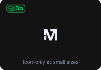
The mark and lockups carry brand recognition. Treat them as fixed components, not editable shapes.Do
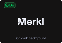
Use the mark on dark surfaces, monochrome.

Use the mark on light surfaces in dark navy.
Use the symbol alone for small surfaces and app icons.

Maintain clear space equal to the cap height of the M.
Don't
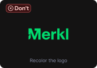
Don't recolor the mark with brand-only hues.
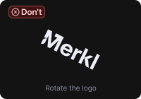
Don't rotate or tilt the mark.
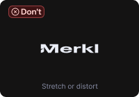
Don't stretch, squash, or distort the proportions.
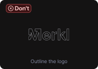
Don't outline. The mark is solid fill.
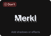
Don't add shadows, glows, or any effect.
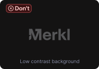
Don't place the mark on a low-contrast background.

Don't combine the mark with another brand inline.
Don't misspell or alter the wordmark.
Minimum size
Below the minimums, the mark stops reading. For ultra-small surfaces, use the favicon variant instead.
 Logotype · 80px wide min
 Logo · 24px min
 Favicon · 16px min
Co-branding
For partner co-branding, place the Merkl logo next to the partner mark separated by a thin vertical rule, both at equal optical height. Use the symbol, not the logotype, in the lockup.
Partner logo
Symbol + partner mark · equal optical height, 24px gap, 1px rule. Order: Merkl on the left when Merkl is the host, otherwise reversed.
Naming in copy
"Merkl" is always Title Case. Product names take Title Case (Merkl App, Merkl Studio, Merkl Pay). Features take sentence case (Reward forwarding, Cross-chain boost).Do
- Merkl
- Merkl App
- Merkl Studio
- Merkl Pay
- Powered by Merkl
Don't
- MERKL
- merkl
- MeRkL
- merkl.xyz (in body copy)
- Merkl® (no registered mark)
Colors
Six brand-kit colors. Click any hex to copy. Purple and Blue are also product UI colors. Teal, Orchid, and Warm Orange live in marketing and illustration only.Purple
Blue
Dark Navy
Teal
Orchid
Warm Orange
Gradients
Gradients live in the brand layer only, never in product UI. Click any stop list to copy the CSS.Cold
Green to purple
Blue to orchid
Rainbow
Need a custom layout or asset variant?
For attribution exception requests or partner co-branding, see the attribution guidelines.